DilamcoDilamco
LightMaintenanceVisual consistency

Colours and finishes: style, light and maintenance

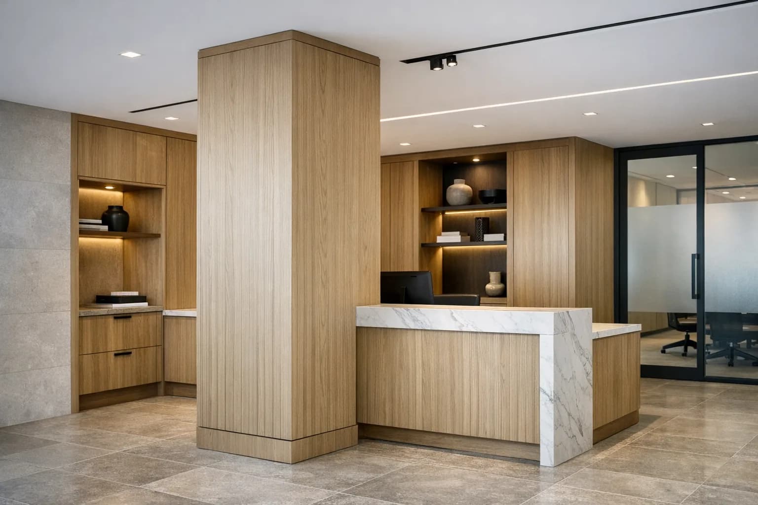
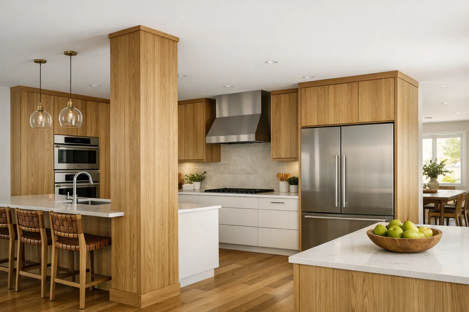
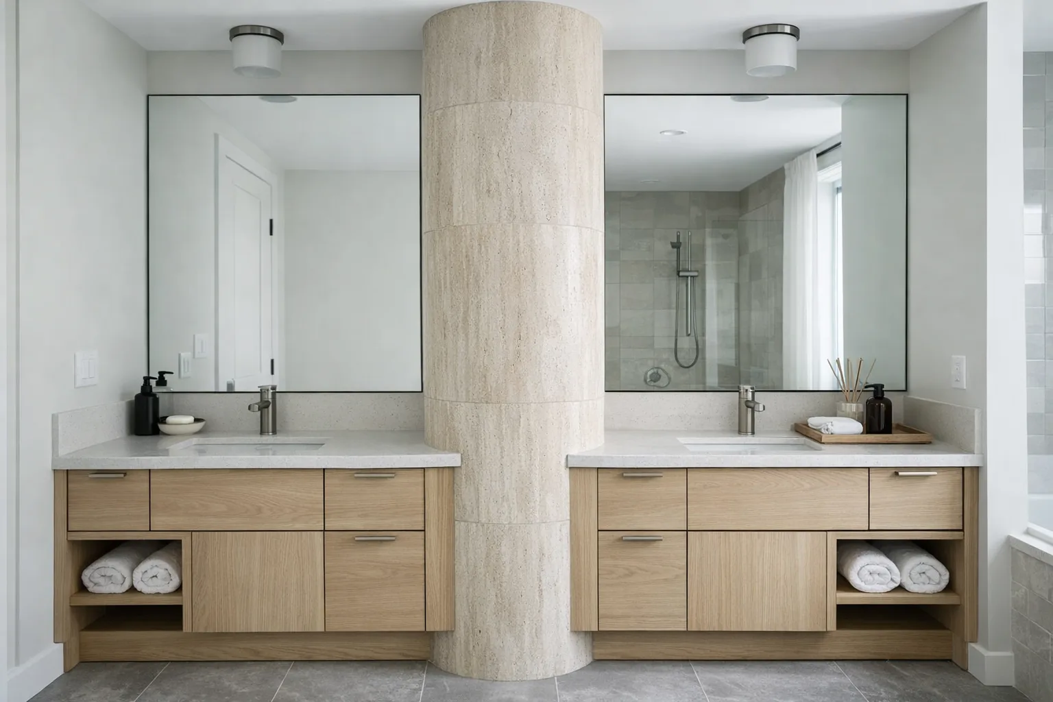
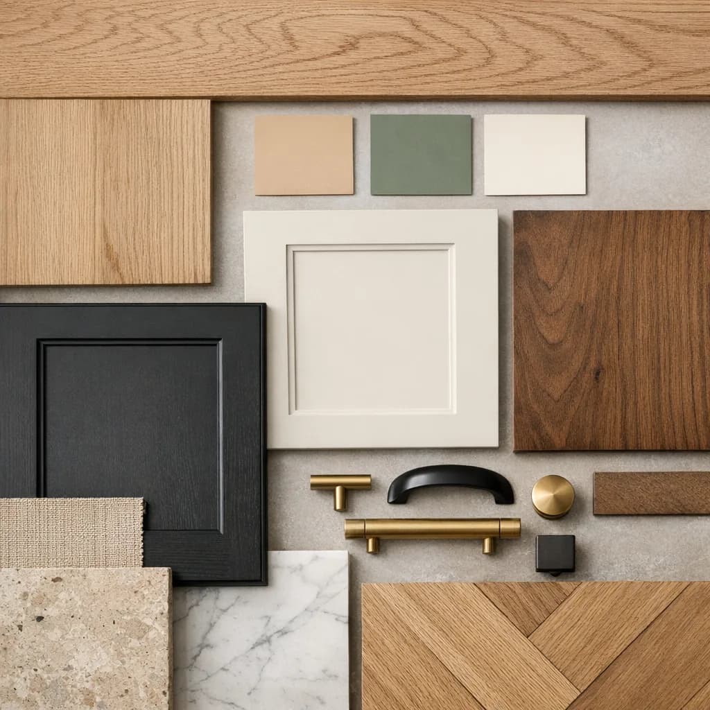
Colour influences light, how a space is perceived and maintenance. The right choice depends on the material, the use and the real context.

Colour and finish choices for a custom project

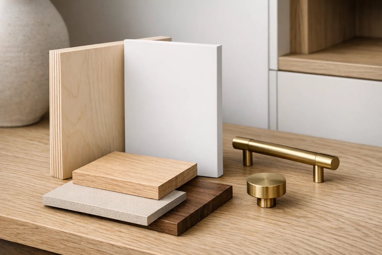
A good finish should look great today and be easy to live with tomorrow

A simple method for choosing

Structuring choices early in the design phase prevents rendering mistakes. You need to consider light, volume, maintenance, the type of material and the use context before validating a palette.

Light

A colour does not react the same way depending on orientation and light sources.

Volume

Contrast and visual mass change how a space is perceived.

Use and maintenance

Kitchens and bathrooms call for pragmatic choices.

Material and finish

MDF, melamine and wood do not produce the same look.

Main finish families

Neutral finish palette for custom furniture
Neutrals

Timeless, bright and easy to integrate.

Timeless
Custom furniture in dark tones
Dark tones

Strong visual impact, require good lighting.

Accent
Natural solid wood texture
Wood and textures

Bring warmth and natural variation.

Natural
Custom kitchen with a cohesive finish palette
Kitchen

Coordinate countertop, backsplash, flooring and maintenance.

Kitchen
Custom bathroom with suitable finishes
Bathroom

Humidity, frequent cleaning and ventilation matter.

Bathroom
Visual comparison of materials and finishes
Materials

The final finish also depends on the chosen substrate.

Substrate

Colour and material: real impact on the result

The result does not come from colour alone. It also depends on the texture, the regularity of the substrate and the finish chosen.

MDFWoodMelamine
Quick reference
  • 1MDF: more uniform for painting
  • 2Wood: natural texture and variation
  • 3Melamine: wide variety of decors
  • 4The same tone changes depending on the substrate

Finishes and maintenance

The right finish is not just the one that looks good on the sample. You also need to think about marks, cleaning and everyday tolerance.

  • Matte. Very elegant, but sometimes more demanding to maintain.
  • Satin. Often a good compromise between look and maintenance.
  • Gloss. Brighter, but marks more easily depending on the context.
Finish choices and colour samples
Common mistake
Choosing an inspiration without re-contextualizing it to the real light, the real volumes and the real use of the project.

FAQ - Colours and finishes

Need help framing your finish choices?

We help you choose a palette that ages better visually, is easier to live with and stays consistent with the materials chosen.